
Custom presentations
Ce contenu n’est pas encore disponible dans votre langue.
This section contains standalone presentations designed for specific audiences and time constraints.
20-minute high-level overview
Section titled “20-minute high-level overview”A condensed introduction to FASTR methodology covering the key concepts from data quality assessment through coverage estimation. Designed for executive briefings or introductory sessions.
Duration: ~20 minutes (15 slides)
Audience: Decision-makers, new stakeholders, introductory workshops
Slide deck structure
Section titled “Slide deck structure”The presentation follows the FASTR analytical pipeline:
- Introduction (5 slides): What is FASTR, the rapid-cycle analytics approach, and FASTR vs DHIS2
- Data quality assessment (3 slides): The three dimensions and their objectives
- Data quality adjustment (2 slides): Methods and sensitivity analysis
- Service utilization (2 slides): Tracking volumes and detecting disruptions
- Coverage estimation (4 slides): Methodology and outputs
FASTR High-Level Overview
Section titled “FASTR High-Level Overview”Facility Analytics for Service Tracking and Results
A 20-minute introduction to rapid-cycle analytics for RMNCAH-N monitoring
What are we trying to achieve?
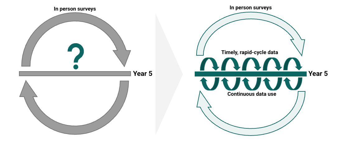
Section titled “What are we trying to achieve?”Rapid cycle analytics accelerates improvements in RMNCAH-N outcomes by increasing the systematic use of data for decision making
How can this be achieved?
Section titled “How can this be achieved?”Timely, rigorous, and low-cost approaches to monitoring PHC systems, underpinned by capacity building and data use support aligned with country demand and needs

What is FASTR?
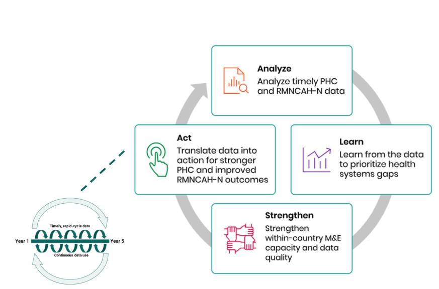
Section titled “What is FASTR?”An approach to catalyzing continuous ‘analyze, learn, strengthen, act’ cycles to drive the systematic use of timely data for decision making.
What is the FASTR approach to RMNCAH-N service use monitoring?
Section titled “What is the FASTR approach to RMNCAH-N service use monitoring?”Quarterly analyses of DHIS2 data, focusing on prioritized national indicators
Building sustainable tools to ensure that stakeholders who need to use data can generate the right analysis and visualizations, at the right time, on their indicators of interest
Combining analysis and visualization with capacity strengthening and data use support for sustainability and institutionalization

Why FASTR? Value add beyond standard DHIS2 analysis
Section titled “Why FASTR? Value add beyond standard DHIS2 analysis”DHIS2 provides the foundation - robust data collection, storage, and basic visualization
FASTR builds on this foundation with:
- Data quality adjustment - Automatically adjusts for outliers and completeness gaps before analysis
- Advanced analytical methods - Disruption detection, coverage projection, and sensitivity analysis
- Standardized visualizations - Percent change approach to identify meaningful fluctuations across indicators
- Improved coverage estimation - Back-calculates denominators from surveys rather than relying solely on catchment populations
- Faster analytics cycles - Pre-built analytical pipeline aligned with country decision-making timelines
- Built-in capacity strengthening - Reproducible methods that build local analytical skills
Data quality assessment
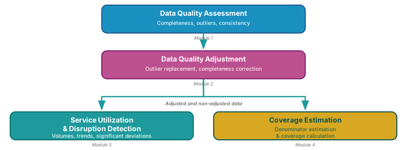
Section titled “Data quality assessment”The FASTR analysis follows a sequential workflow:
- Assess data quality - Identify issues with completeness, outliers, and consistency
- Adjust for quality issues - Apply corrections to improve data reliability
- Analyze adjusted data - Generate service utilization and coverage estimates
Philosophy: Data quality should not be a barrier to data use. Using data and providing feedback is the first step toward improving data quality.
Three dimensions of data quality
Section titled “Three dimensions of data quality”| Dimension | What it measures | Red flag |
|---|---|---|
| Completeness | % of facilities reporting each indicator | Gaps by region or time period |
| Outliers | Suspiciously high values vs. facility history | Data entry errors |
| Consistency | Logical relationships (e.g., ANC1 ≥ ANC4) | System or process issues |
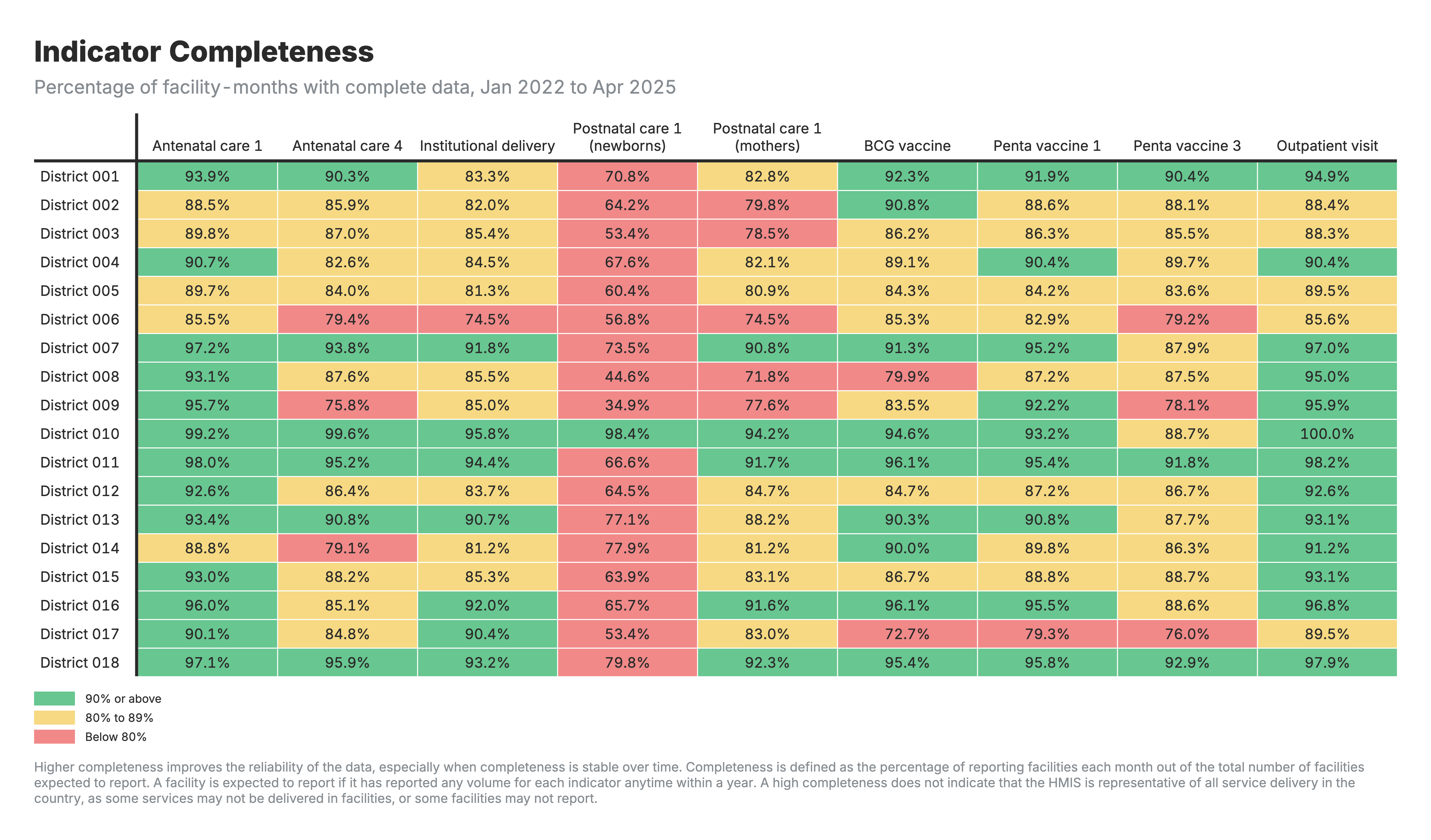
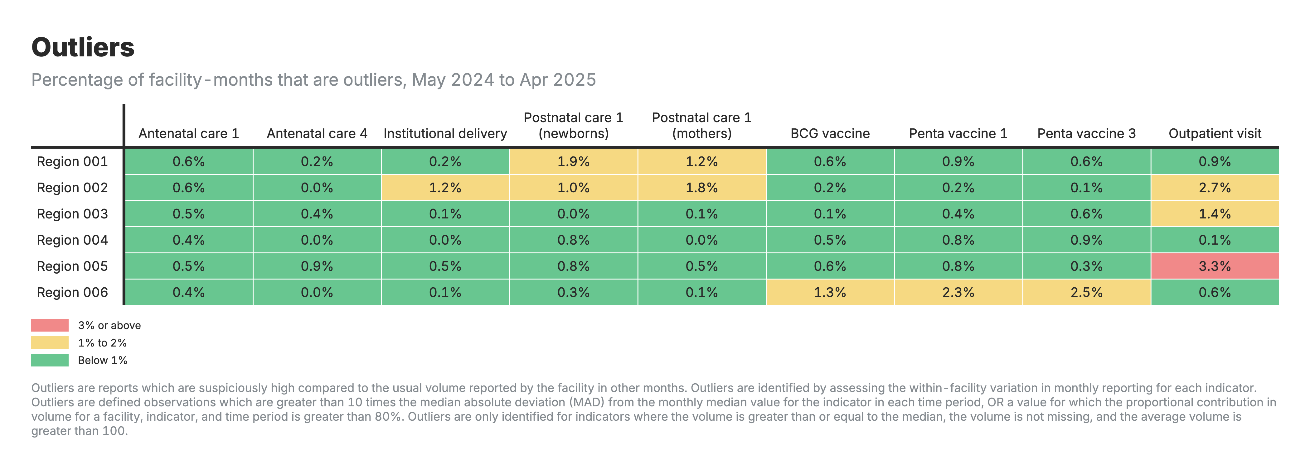
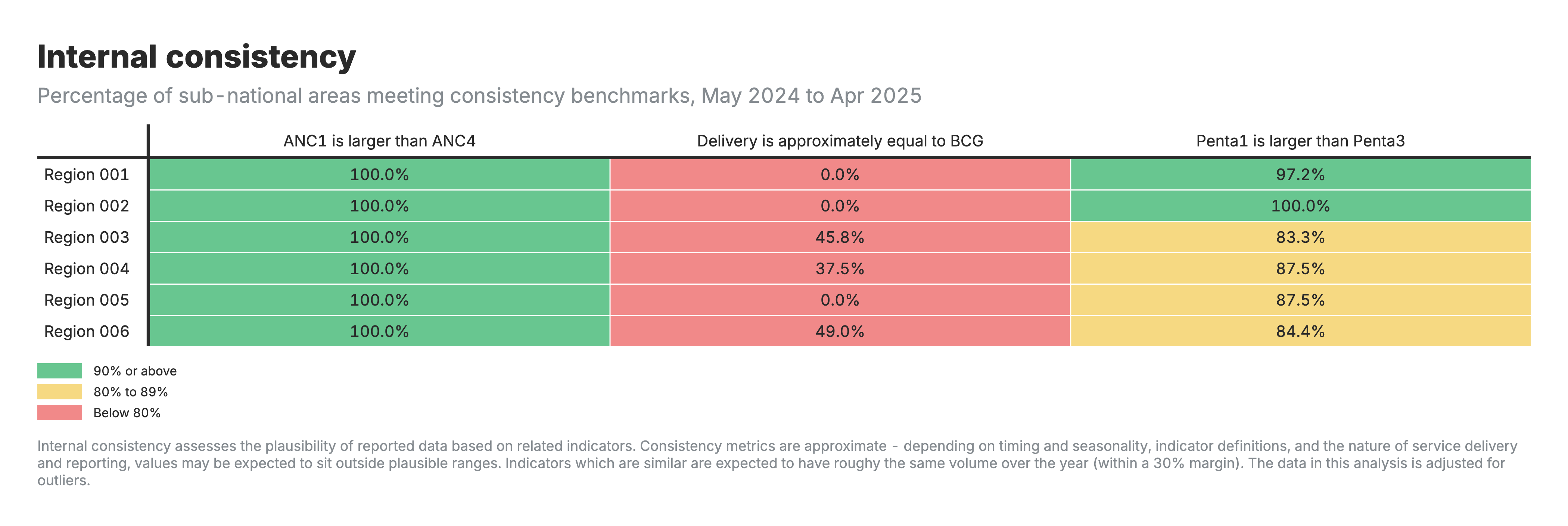
Each dimension generates a heatmap showing issues by indicator and area.
In summary … Data quality assessment
Section titled “In summary … Data quality assessment”Objectives of data quality assessment:
-
Enable analytical adjustment: Systematic assessment supports targeted adjustments, enhancing the utility of HMIS data for evidence-based decision-making
-
Monitor data quality trends: Inform indicator selection, guide targeted interventions, and evaluate improvement initiatives over time
Key learning questions:
- Which indicators have the highest completeness and are most reliable for analysis?
- Are there specific regions or time periods with consistent data quality issues?
- Has data quality improved since the last assessment cycle?
Data quality adjustment
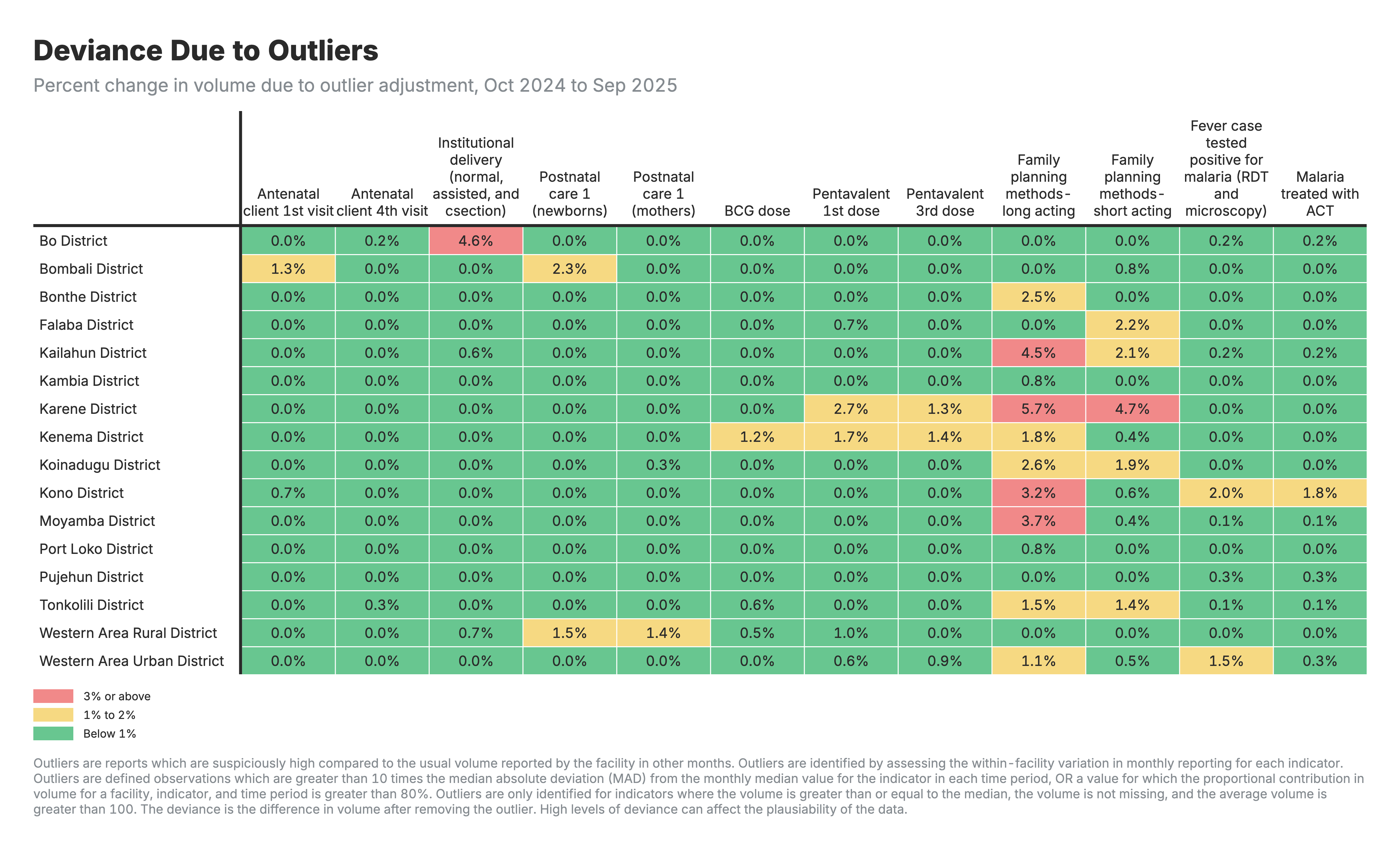
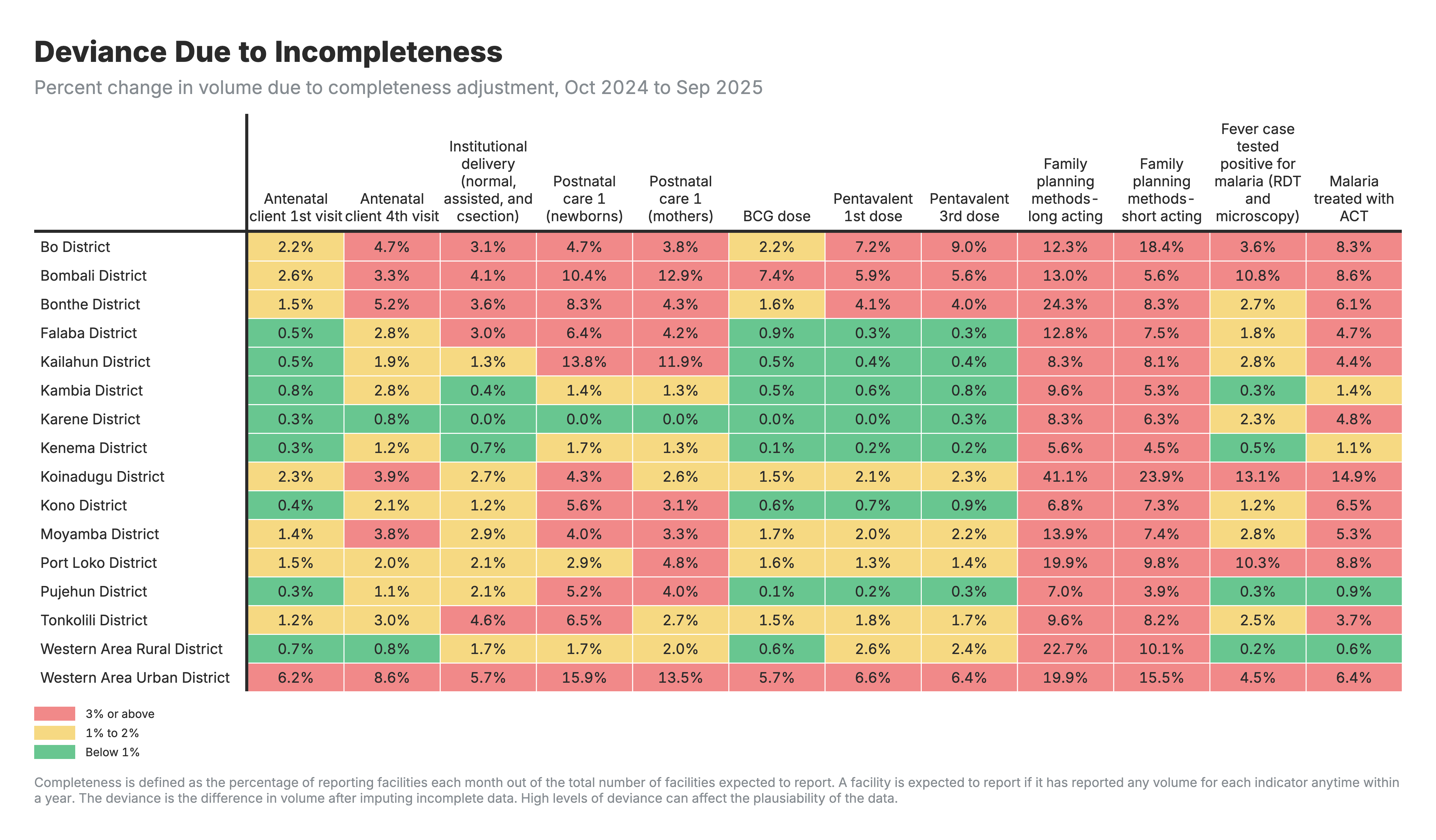
Section titled “Data quality adjustment”Why adjust? Outliers and reporting gaps distort analysis if left uncorrected.
How? Replace problematic values with 6-month rolling averages from each facility’s historical data.
Four scenarios for sensitivity analysis:
| Scenario | What it shows |
|---|---|
| Unadjusted | Raw data as reported |
| Outliers-only | High values smoothed |
| Completeness-only | Gaps filled |
| Both adjusted | Full correction applied |
Excluded: Mortality indicators and low-volume indicators (<100/month)
In summary … Data quality adjustment
Section titled “In summary … Data quality adjustment”Objectives of data quality adjustment:
-
Improve data reliability: Replace outliers and fill reporting gaps using facility-specific historical patterns, without discarding valuable information
-
Enable sensitivity analysis: Compare results across adjustment scenarios (unadjusted, outliers-only, completeness-only, both) to assess robustness of conclusions
Key learning questions:
- How much do results change between unadjusted and adjusted data?
- Which regions or indicators require the largest adjustments?
- Are there facilities or areas where data quality improvements should be prioritized?
Service utilization analysis
Section titled “Service utilization analysis”Track service volumes over time, detect disruptions, compare across areas.
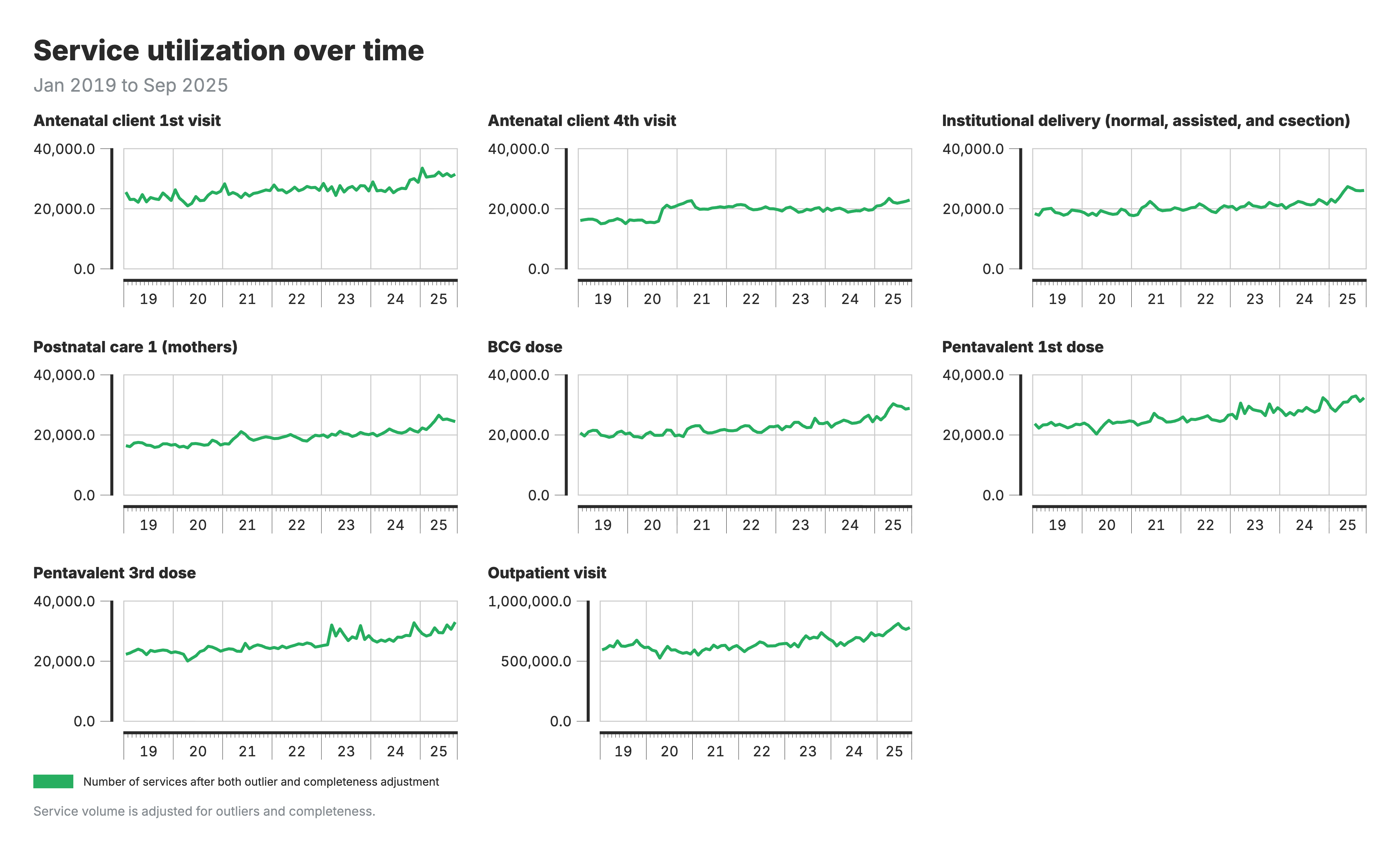
Volumes over time: Look for trends and sudden changes
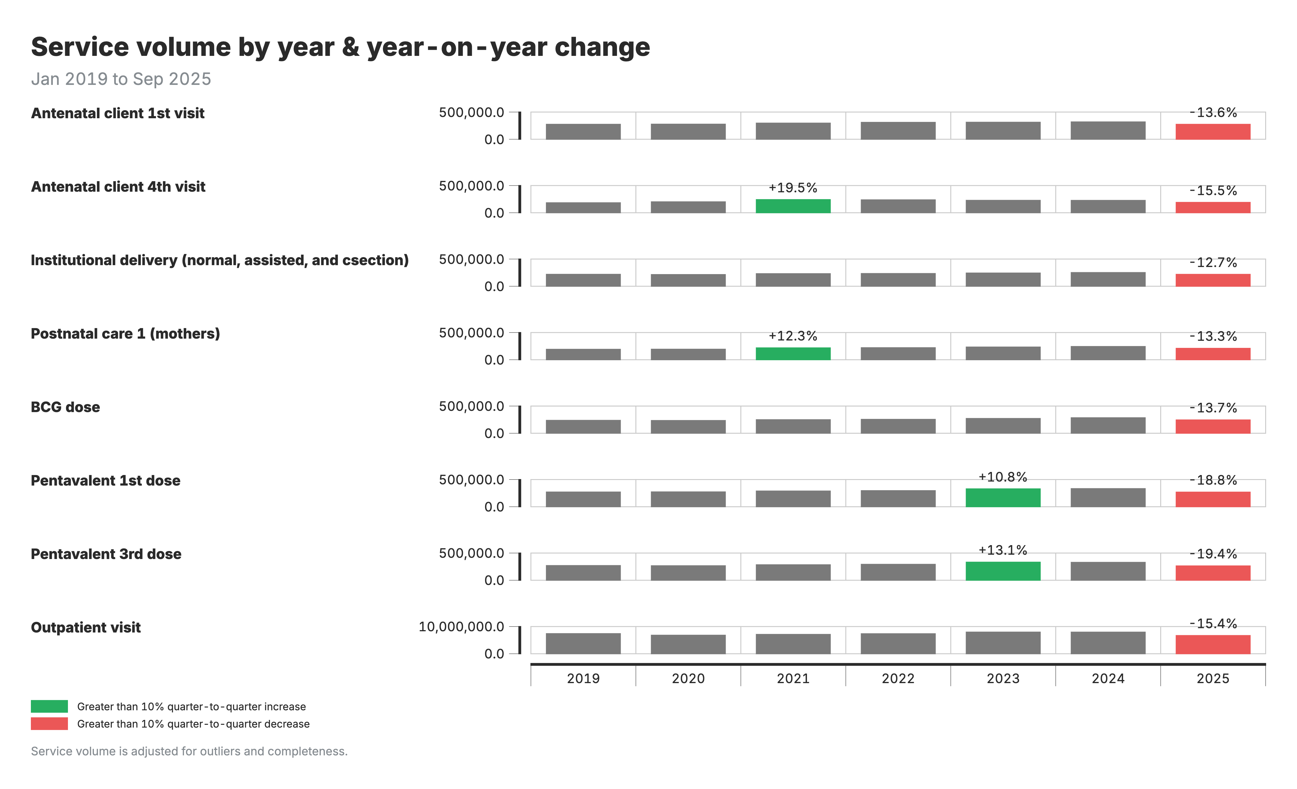
Year-over-year change: Changes >±10% flagged for investigation
Disruption detection: Compare actual volume to model-predicted expected volume (accounting for seasonality). Investigate: COVID? Strikes? Stockouts? Campaigns?
In summary … Service utilization
Section titled “In summary … Service utilization”Objectives of service utilization analysis:
-
Track service delivery trends: Monitor volumes over time to identify whether services are reaching the population as expected
-
Detect disruptions and surpluses: Compare actual service volumes to model-predicted expected values, accounting for seasonality, to flag significant deviations
Key learning questions:
- Are service volumes increasing, decreasing, or stable compared to last year?
- Were there disruptions during specific periods (COVID, strikes, stockouts)?
- Which regions show the largest year-over-year changes requiring investigation?
Coverage estimation
Section titled “Coverage estimation”The challenge: HMIS has numerators (services) but not reliable denominators (target population). Standard catchment populations are often inaccurate. Surveys provide reliable coverage but only every 3-5 years.
FASTR solution:
- Back-calculate denominators from survey coverage + HMIS volumes
- Example: 10,000 ANC1 visits ÷ 80% survey coverage = 12,500 pregnancies
- Validate against multiple denominator options (HMIS-derived, UN projections)
- Project forward by anchoring to last survey and applying HMIS trends
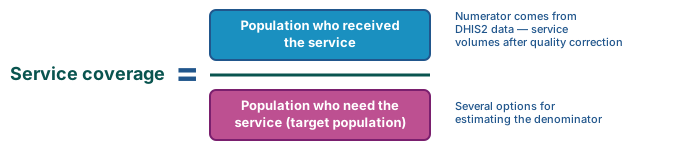
Coverage = services delivered ÷ target population
Coverage outputs
Section titled “Coverage outputs”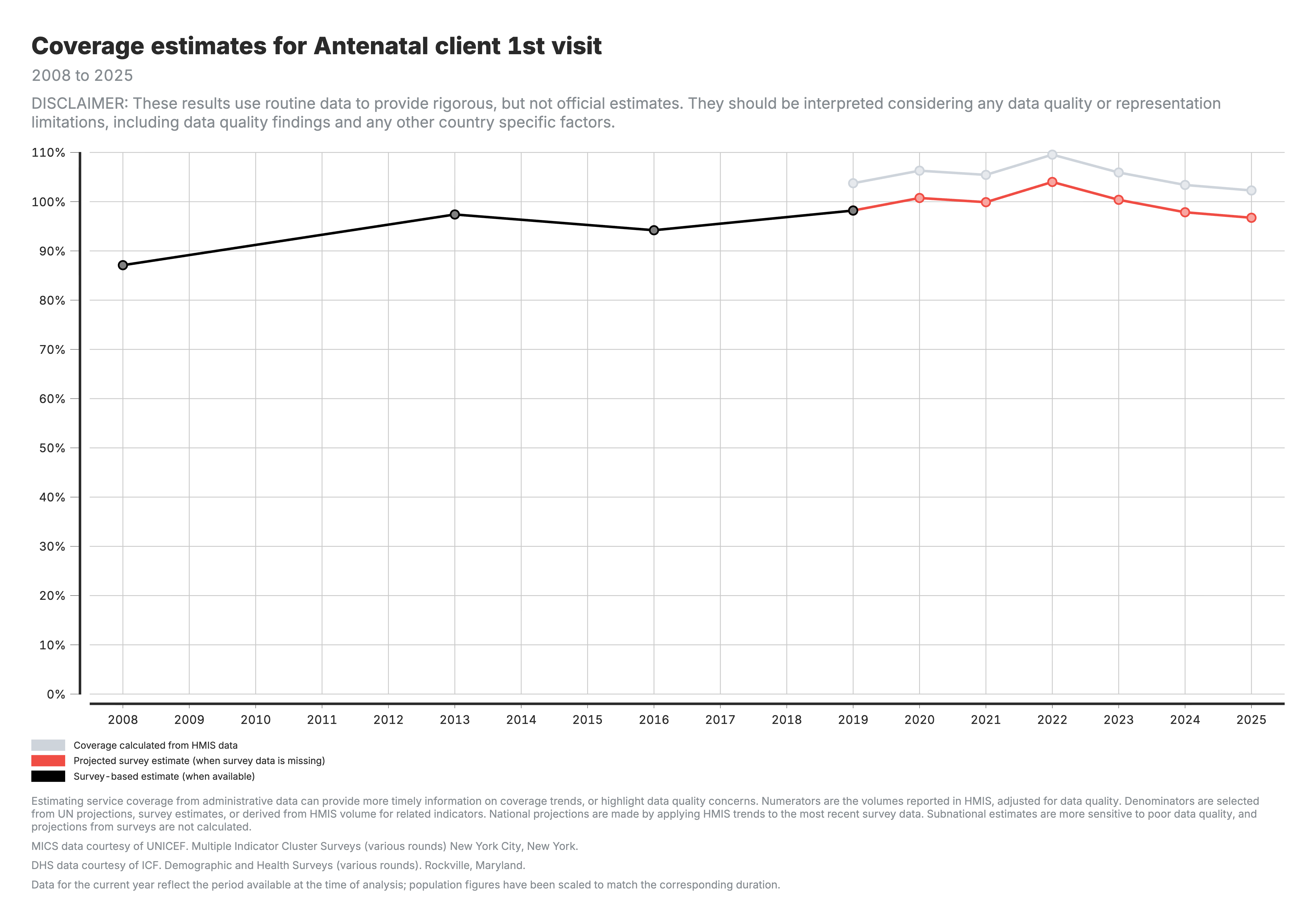
National trends: Black = survey, Grey = HMIS-derived, Red = projected
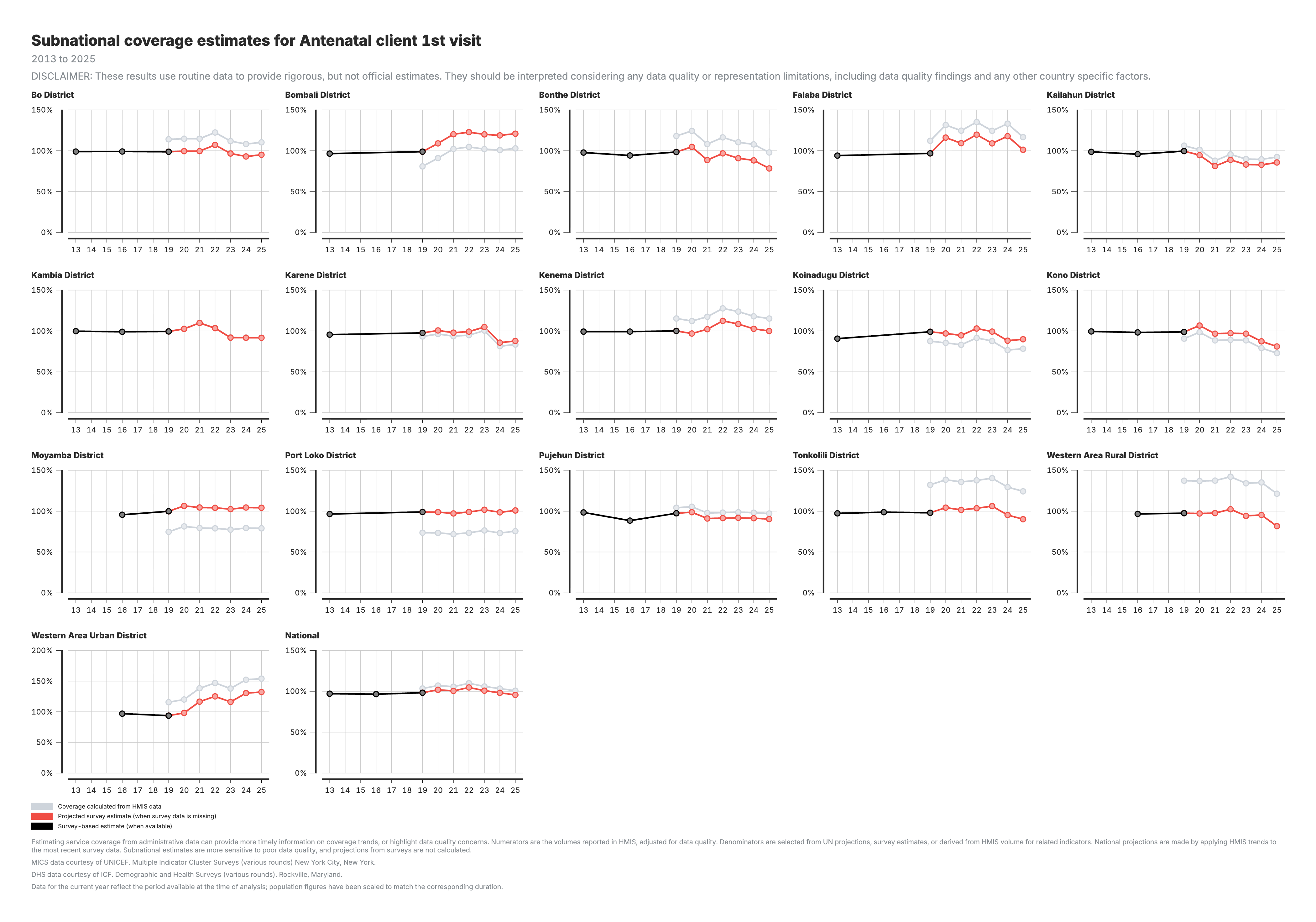
Subnational comparison: Identify low-coverage areas for prioritization
Watch for:
- Coverage >100%: denominator underestimate or double-counting
- Coverage very low: denominator overestimate or under-reporting
- Large gap between HMIS and survey: denominator accuracy issue
In summary … Coverage
Section titled “In summary … Coverage”Objectives of coverage analysis:
-
Identify unmet needs: Identifying gaps between the population in need and those receiving services, uncovering unmet needs that utilization alone cannot reveal
- While utilization measures “how many people came,” coverage answers “how well we are meeting the needs of those who required care”
-
Explore inequities: Exploring inequities in service coverage by geographical location, allowing for targeting of recommended actions
Key learning questions:
- Has coverage of Penta1 improved since the most recent DHS?
- Has coverage of ANC1 improved more in state 1 as compared to state 2?