
The AI assistant
Overview
Section titled “Overview”The FASTR platform includes an AI assistant that provides on-demand support for data interpretation and report generation. Many health systems have more data than capacity to analyze it — M&E staff often have limited time for in-depth analysis, analytical skills vary across teams and regions, and turning data into narrative insights requires both technical and contextual knowledge.
The AI assistant helps bridge this gap by explaining trends and patterns in plain language, generating draft reports and key messages, and answering questions about the data or methodology.
Capabilities
Section titled “Capabilities”Data exploration and analysis
Section titled “Data exploration and analysis”The AI assistant can query metrics and indicators from installed analysis modules, filter and disaggregate by geography, time, and demographics, view raw CSV data behind metrics and visualizations, and explore data across time periods, locations, and sources.
Visualization and display
Section titled “Visualization and display”The assistant can display existing project visualizations and work with replicants of multi-variant charts. It can create new chart configurations such as bar charts, line graphs, and tables, and combine charts, tables, and narrative text.
Knowledge and documentation
Section titled “Knowledge and documentation”The AI has access to FASTR methodology documentation and can explain indicators and calculation methods. It interprets results with context on data quality, trends, and limitations, and answers questions about health data.
Presentation and communication
Section titled “Presentation and communication”The assistant builds narratives that combine visuals and text, highlighting key findings and patterns. It creates focused views by filtering to relevant subsets and provides evidence-based insights grounded in the underlying data.
How it works
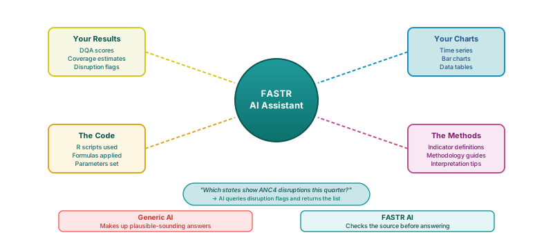
Section titled “How it works”The AI follows a “read before responding” principle — it never guesses. For data questions, it finds the relevant metric, reads the actual data values, and responds with a visualization. For methodology questions, it looks up documentation, reads the details, and explains in plain language.
Privacy and sharing
Section titled “Privacy and sharing”What’s private
Section titled “What’s private”Your conversation with the AI and the questions you ask and answers you receive are private to you. Other team members cannot see what you’re exploring.
What’s shared
Section titled “What’s shared”The underlying data (same HMIS data), saved visualizations in the project library, slide decks and reports you create and save, and project settings and module results are shared with the team. Everyone can see saved content.
Where the AI provides greatest value
Section titled “Where the AI provides greatest value”The AI assistant provides the greatest value in two areas: visualizations (exploring, modifying, and understanding charts) and slide decks (assembling presentations from data and saved charts). It can also query metrics, view module status, and help understand data coverage, though modules and settings are managed directly by users.
Effective prompting
Section titled “Effective prompting”A good prompt includes six elements: (1) a clear purpose, (2) a defined audience, (3) specific geography, time, and scope, (4) interpretation guidance, (5) an output format, and (6) guardrails to keep the AI grounded in the data. The rule of thumb is simple: before sending a prompt, ask yourself whether it’s obvious what you want back — if not, add one more detail.
When AI helps — and when it doesn’t
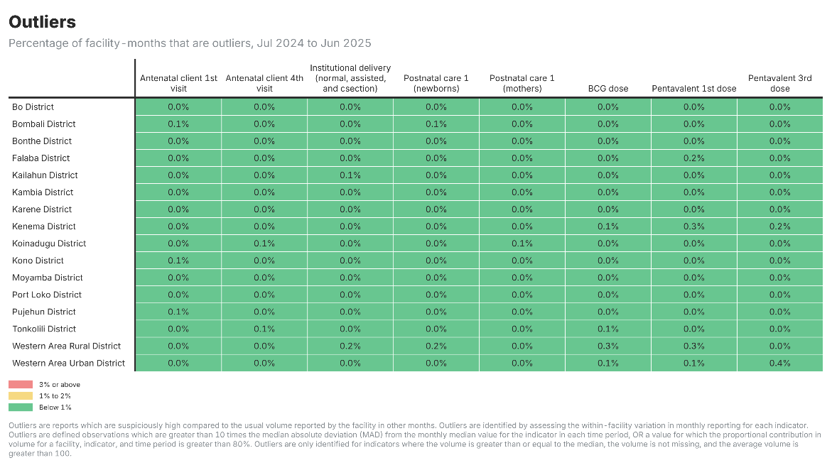
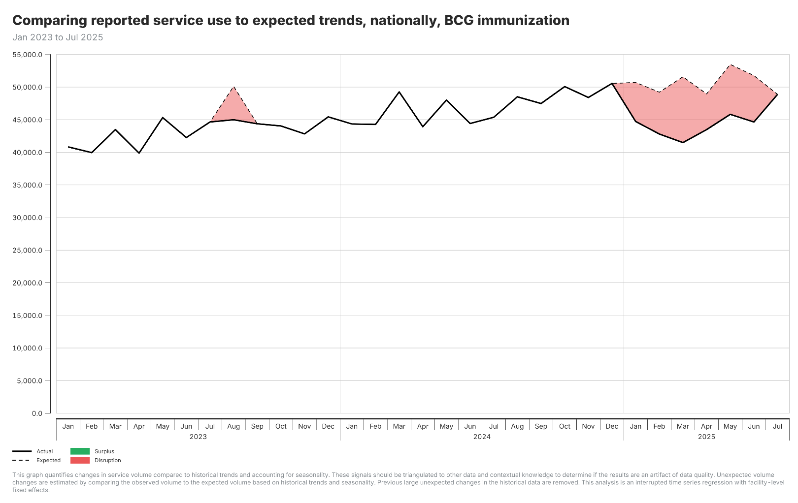
Section titled “When AI helps — and when it doesn’t”Not every visualization benefits equally from AI interpretation. When patterns are obvious — for example, all data quality indicators below 1% — additional AI-generated text adds length without adding insight. But when patterns are complex — sustained disruptions across multiple time periods, varying magnitudes, potential structural breaks — AI interpretation can quantify and contextualize patterns that are difficult to assess visually.
Key principles
Section titled “Key principles”AI is an accelerator, not a decision maker. You stay in control of judgement (deciding what matters), interpretation (understanding context), and action (making decisions). All calculations — outlier detection, coverage estimates, data quality scores — use proven statistical formulas, not AI. AI interprets and explains. You decide and act.
The AI assistant
Section titled “The AI assistant”The FASTR platform includes an AI assistant that provides on-demand support for data interpretation and report generation.
Context: Many health systems have more data than capacity to analyze it
- M&E staff often have limited time for in-depth analysis
- Analytical skills vary across teams and regions
- Turning data into narrative insights requires both technical and contextual knowledge
What it does: The AI assistant helps bridge this gap by:
- Explaining trends and patterns in plain language
- Generating draft reports and key messages
- Answering questions about the data or methodology
What the AI assistant can do
Section titled “What the AI assistant can do”Answer questions about your data
- “Which regions have the most outliers?”
- “How has reporting completeness changed over time?”
- Creates charts and explanations on-the-fly
Explain methodology
- “How are outliers detected?”
- “What does this data quality score mean?”
- Draws from platform documentation
Help build reports
- Generate slide decks from your data
- Combine saved charts with narrative text
- Create presentations for different audiences
Where the AI provides greatest value
Section titled “Where the AI provides greatest value”Visualizations — Explore and understand your data
- Access all saved visualizations within the project
- Review underlying data for any chart or figure
- Modify visualization parameters including chart type, filters, time periods, and disaggregation levels
- Receive explanations of what each visualization represents
Slide decks — Build presentations from your findings
- Generate presentation slides including cover pages, section dividers, and content slides
- Incorporate charts, tables, and narrative text into slide layouts
- Transfer visualizations directly into presentations
- Edit, reorder, duplicate, or remove slides as needed
How conversations work
Section titled “How conversations work”Example conversation:
You: “Which regions have the most data quality issues?” AI: Creates a chart showing data quality scores by region
You: “What’s causing the low score in the Northern region?” AI: Breaks down the issues: outliers, completeness gaps, consistency problems
You: “Create a summary for my director” AI: Builds a slide highlighting priority areas for data quality improvement
Think of the AI as a data analyst on your team — someone who can instantly pull reports, create charts, and answer questions about your health data.
Tips for better answers
Section titled “Tips for better answers”Be specific about:
- Which service — “ANC1” instead of “antenatal care services”
- Which time period — “last 12 months” or “2024”
- Which location — “Banadir” or “all regions”
You can ask for: Charts, explanations, comparisons, reports, data tables
Follow-up questions work great:
- Start broad: “Show me data quality scores by region”
- Narrow down: “What about just ANC indicators?”
- Go deeper: “Why is the Northern region so low?”
- Take action: “Create a slide about this for my presentation”
What makes a good prompt?
Section titled “What makes a good prompt?”1. Be clear on purpose
- Is the task explicit? (interpret, summarize, compare, generate slides)
- Is the use case clear? (performance review, donor update, training)
2. Define the audience
- Is the intended audience stated? (MoH managers, analysts, policymakers)
- Is the level of technical detail appropriate?
3. Specify geography, time, and scope
- Is the country or subnational level specified?
- Is the time period clear?
- Are priority indicators or services named?
4. Give interpretation guidance
- Should the AI describe trends, compare areas, or identify disruptions?
- Should it stick to description or include implications?
5. Specify the output format
- Bullet points or narrative? Slide-ready text or report prose?
- Example: “Provide 3–4 slide-ready bullets in plain language.”
6. Set guardrails
- Ask the AI to stay grounded in the data shown
- Request that uncertainty or data quality issues be flagged
Rule of thumb: Before you send a prompt, ask yourself: is it obvious what I want back? If not, add one more detail.
What happens when you log off
Section titled “What happens when you log off”| Content | Saved? | Notes |
|---|---|---|
| Your AI conversation | Temporary | AI conversations are saved locally in the browser and are visible only to the person using that browser. Refreshing the page or closing the tab will not delete the conversation. The chat history will only disappear if the browser cache is cleared or a different browser or device is used. |
| Slide decks/reports you create | Permanent | Saved to project, visible to team |
| Saved visualizations | Permanent | Remain in project library |
| Downloaded exports | Permanent | Saved to your computer |
Private vs shared on team projects
Section titled “Private vs shared on team projects”Private to you:
- Your conversation with the AI
- Questions you ask and answers you receive
Other team members cannot see what you’re exploring.
Shared with team:
- The underlying data (same HMIS data)
- Saved visualizations in project library
- Slide decks/reports you create and save
- Project settings and module results
Everyone can see saved content.
How teams work together
Section titled “How teams work together”| Who | Action | Result |
|---|---|---|
| Dr. Amina (Director) | Asks AI about coverage, explores privately, creates slide deck | Deck now visible to all |
| Mohamed (Data Manager) | Asks AI about reporting gaps, saves a chart | Chart in library for everyone |
| Fatima (Program Officer) | Opens Amina’s slides, uses Mohamed’s chart, asks AI to explain | Gets private explanation |
What each person sees:
- Their own AI conversations — Yes
- Saved slides and charts from others — Yes
- Each other’s private questions — No
Two people can use the AI assistant to add to the same slide deck at the same time. Each chat is private, and each AI instance sees only the changes made to the deck — not the conversation.
How the AI assistant works
Section titled “How the AI assistant works”The AI follows a “read before responding” principle — it never guesses.
For data questions:
- Finds the relevant metric
- Reads the actual data values
- Responds with a visualization
For methodology questions:
- Looks up documentation
- Reads the details
- Explains in plain language
AI is an accelerator, not a decision maker
Section titled “AI is an accelerator, not a decision maker”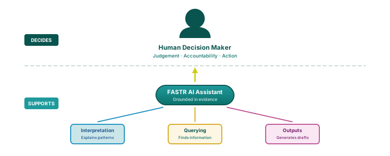
You stay in control of:
- Judgement — deciding what matters
- Interpretation — understanding context
- Action — making decisions
The numbers come from validated methods
All calculations (outlier detection, coverage estimates, data quality scores) use proven statistical formulas — not AI.
AI interprets and explains. You decide and act.
When AI adds little value
Section titled “When AI adds little value”Your interpretation of figure:
Across all districts, outliers are very low, with all indicators averaging below 1%, suggesting consistent reporting quality.
When patterns are obvious, more explanation does not improve understanding.
When AI is helpful
Section titled “When AI is helpful”Your interpretation of figure:
Multiple sustained disruptions through 2023 to 2025, with service use below expected levels during red shaded periods.
AI interpretation of figure:
In August 2023, volumes dropped significantly below expected levels (12% shortfall). Disruption intensified from January to May 2025, with February 2025 showing the largest gap at 10,100 cases (20% below expected).
When patterns are not obvious, AI interpretation can improve our understanding.
Contact: fastr@worldbank.org