
Visualizations
Once your modules have processed data, you’ll want to see the results. Visualizations are how you turn raw analytical outputs into charts, maps, and tables that tell a story. You can customize them, export them as images, or add them to slide decks.
Visualization types
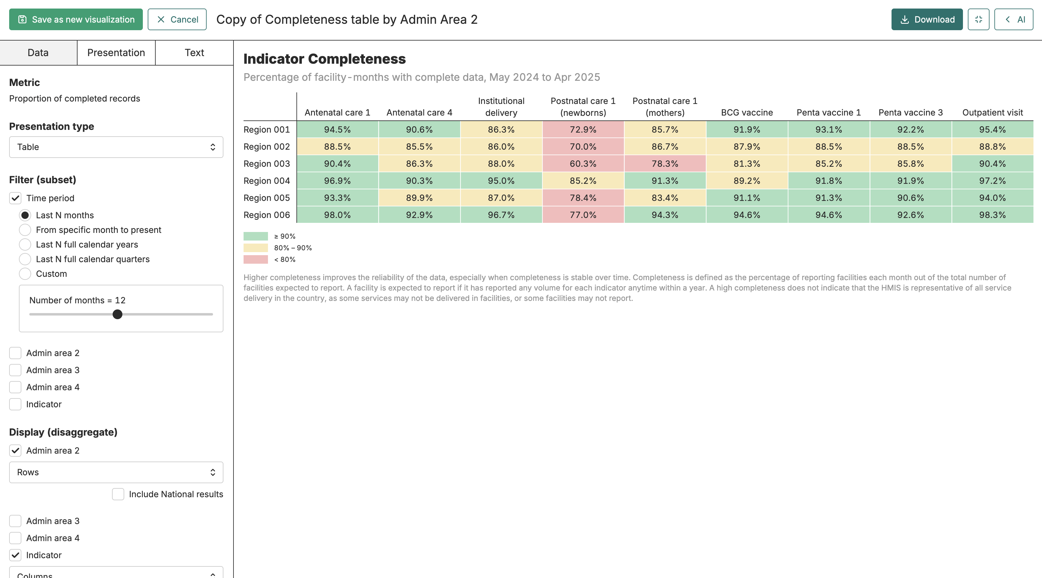
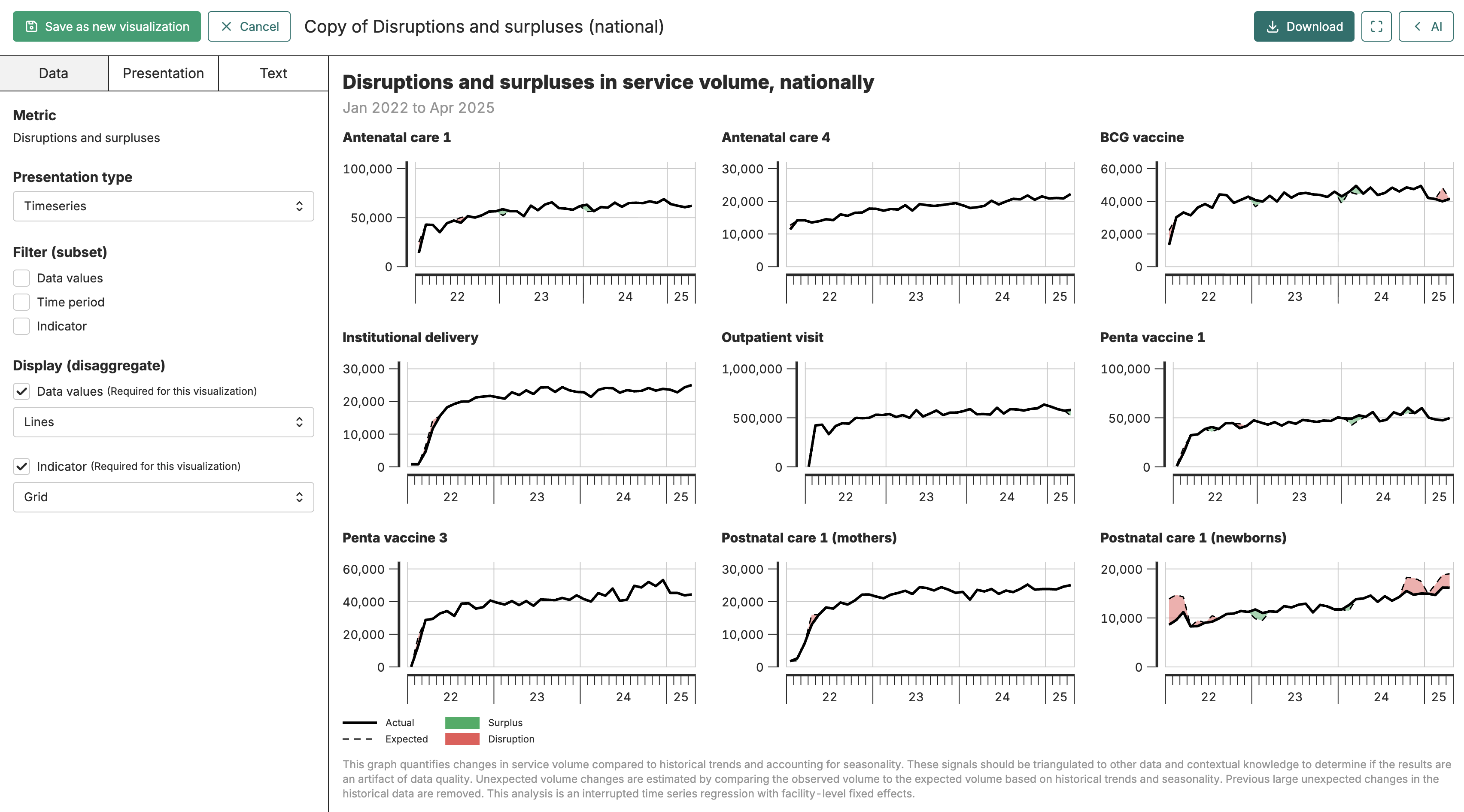
Section titled “Visualization types”FASTR offers five types of visualizations, each suited to different questions. A chart works well when you’re comparing values across categories - for example, outpatient visits by facility type, or coverage rates across districts. Timeseries visualizations show how a metric changes over time, making them useful for spotting trends or seasonal patterns. Maps display data geographically, which helps when you want to see regional variation at a glance. Tables give you the full numeric detail when you need precise values or want to see multiple dimensions at once. Pie charts show proportional breakdowns when you need to visualize how a whole is divided among categories.
The type you choose depends on what question you’re answering. If someone asks “how do our districts compare?”, a map or chart makes sense. If they ask “what’s the exact number for District X in March?”, a table is more useful.
Table
Timeseries
Finding and browsing visualizations
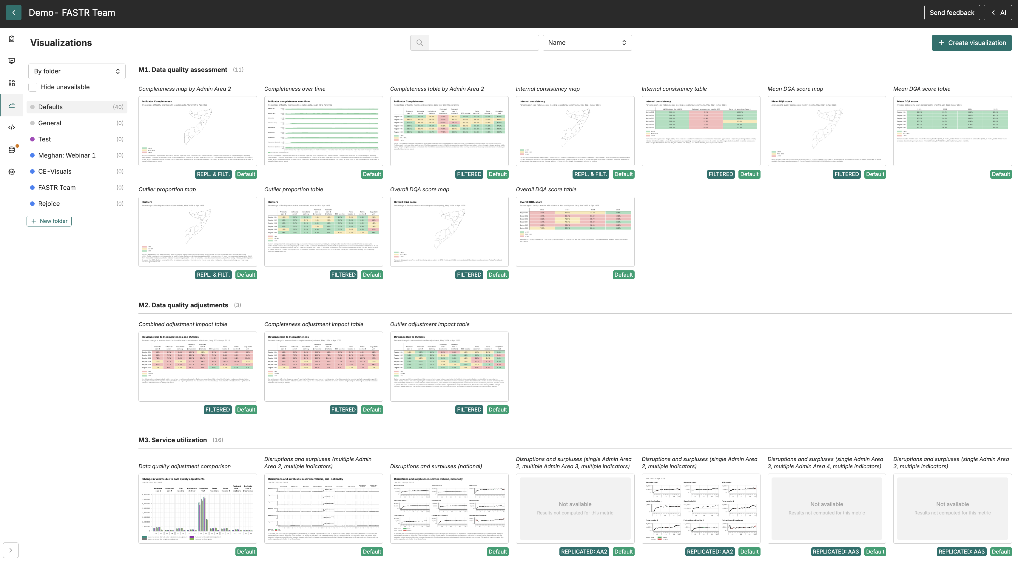
Section titled “Finding and browsing visualizations”Open your project and click Visualizations in the left sidebar. The list shows all visualizations in the project, organized into folders. You can search by name using the search box at the top, and use the sort control to order the list by name or by recently updated.
Some visualizations appear with a “default” badge - these are created automatically from module presets in the attached results package and can’t be edited directly. If you want to modify a default visualization, opening it will create an editable copy that you can customize and save as your own.
When another collaborator is currently editing a visualization, a small colored avatar appears on its card in the list. This lets you see who is working on what before you open a card.
Creating a visualization
Section titled “Creating a visualization”To create visualizations, the project needs a results package attached first.
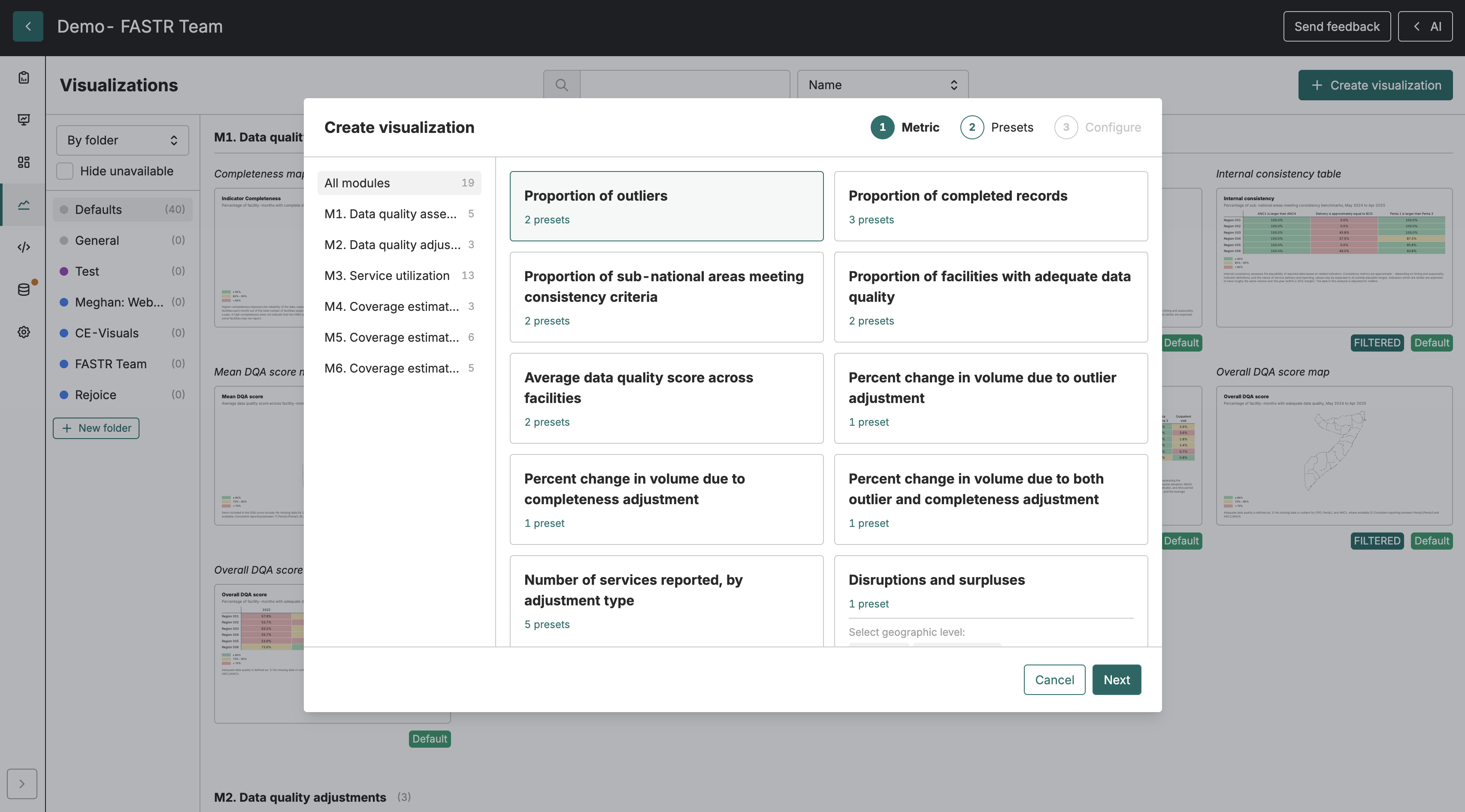
Every visualization starts with a metric. Metrics are the analytical outputs produced by your modules - things like “ANC1 coverage rate” or “data completeness score.” When you create a visualization, you’re deciding how to display one of these metrics.
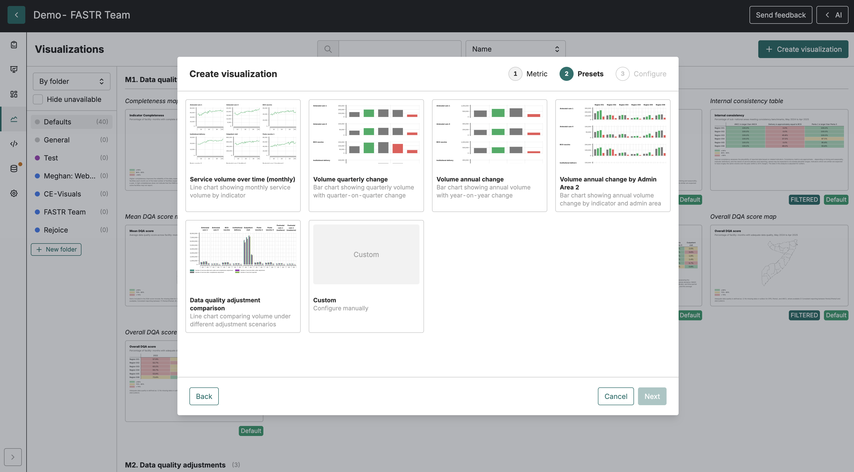
Click Create visualization to start. The first step asks you to select a metric. You can browse by module (useful if you know which analysis produced the output you want) or search by name. Once you’ve selected a metric, you’ll choose how to visualize it.
Presets vs. custom configuration
Section titled “Presets vs. custom configuration”After selecting a metric, you’ll see a list of presets. Presets are ready-made configurations created by the module authors - they represent common ways to view that particular metric. If a preset matches what you need, select it and you’re done. The visualization opens in the editor, ready to use or fine-tune.
If none of the presets fit, choose Custom. This lets you pick the visualization type (chart, timeseries, map, pie chart, or table) and configure how to disaggregate the data. Disaggregation means breaking down a single number into more specific views - instead of “total outpatient visits,” you might show visits by month, by facility type, or by district.
Not every disaggregation works with every visualization type. For example, geographic disaggregation makes sense for maps but not for timeseries. The interface shows you which options are available based on the type you’ve chosen.
Some disaggregation options are available only as filters and cannot be used as disaggregation dimensions on a chart or map. The HFA service category option works this way: you can filter a visualization to show only indicators belonging to one or more service categories, but service category cannot itself be used as a series or axis in the chart. When filtering by service category, a match is made if the indicator belongs to any of the selected categories.
When a disaggregation dimension has only a single value in the underlying data, that dimension is automatically disabled - it cannot be toggled on because disaggregating by it would have no effect. The editor shows a tooltip explaining that the dimension has a single value in the data.
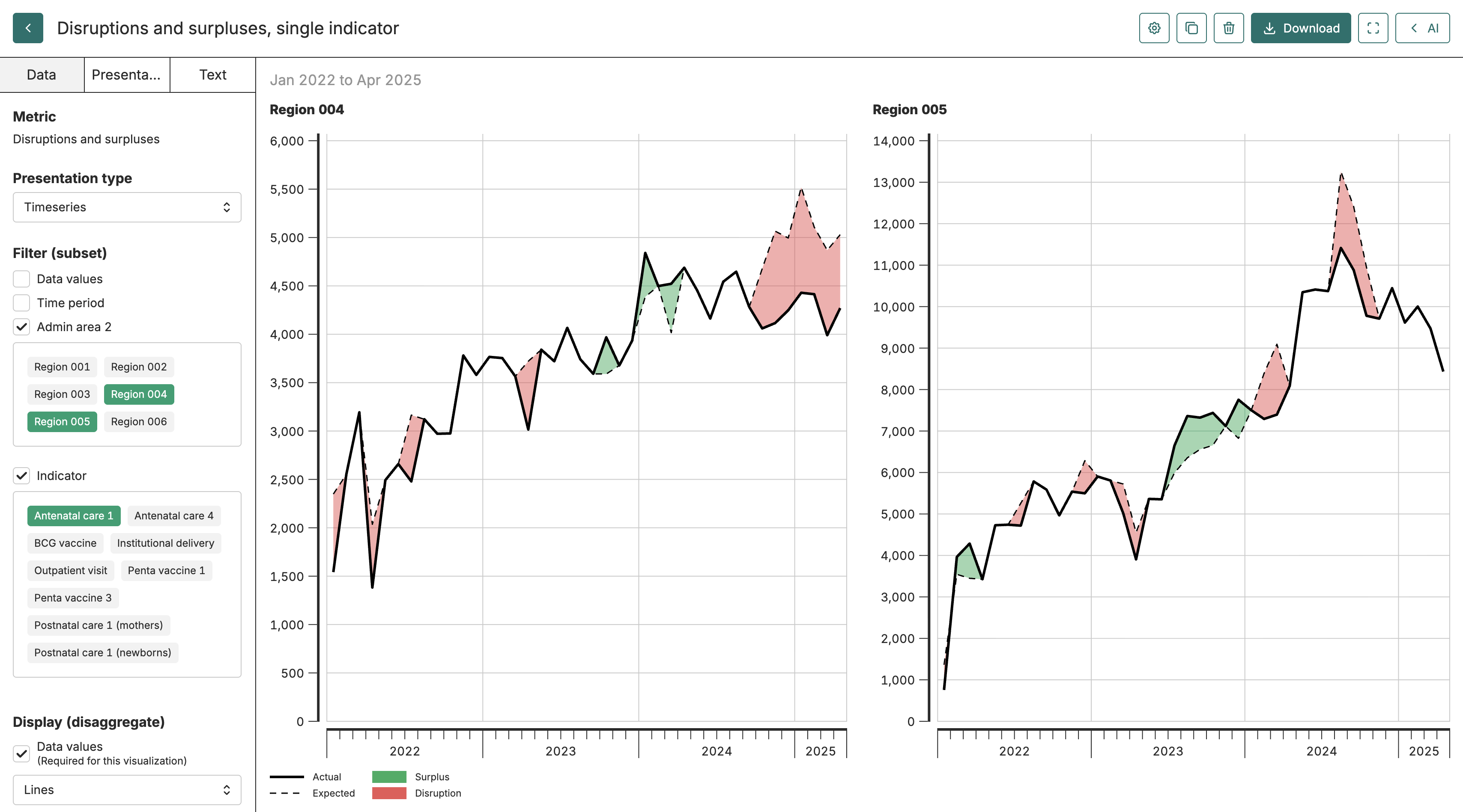
Some chart types have specific data requirements. The disruptions chart, for example, compares two data values (actual and expected) as two series and shades the difference between them. If you select a disruptions chart, make sure both data values are configured - the chart will show an error message prompting you to add the second data value or turn off disruptions mode if only one is present. The Bayesian disruptions chart (disruptions-v2) requires all four data values — observed, expected, lower bound, and upper bound — to be present. If any are missing or filtered out, the chart will show an error prompting you to clear the data value filter or turn off disruptions mode.
The visualization editor
Section titled “The visualization editor”Once you’ve created or opened a visualization, you’re in the editor. The left panel contains all the configuration options, organized into three tabs. The right side shows a live preview that updates as you make changes - you can see immediately how your adjustments affect the output.
When live collaboration is active, each panel tab shows small avatar icons for collaborators currently on that tab, so you can see who is working on Data, Presentation, or Text settings at the same time as you. A Live indicator appears in the header along with undo and redo buttons for reversing your own changes without affecting your colleagues’ edits. If the server-side checkpoint is failing, the header shows Not saving — retrying… with a red dot instead of the Live indicator, so you know to check your connection.
Data tab
Section titled “Data tab”The Data tab controls what information appears in the visualization. This is where you narrow the time range, add or remove disaggregations, or filter to specific values.
Period filters let you focus on a particular time window. If your project contains three years of data but you only want to show the last six months, you’d set that here. Disaggregations let you break down the data - adding a “facility type” disaggregation to a chart would show separate bars for hospitals, health centers, and dispensaries instead of a single total.
For admin-area and facility disaggregations, you can optionally include a roll-up total row by checking the option next to the relevant disaggregation. The label shown depends on context: it reads Include National results for a national admin-area total, Include results for all areas when the visualization is scoped to a specific parent area, or Include results for all facilities for a facility total. This total row appears at the start or end of the chart or table depending on your position setting. The option is available on a disaggregated admin-area level (admin area 2, 3, or 4) or facility column, provided that level is not shown as a replicant or map area and is not filtered to a single value; it is also not available on maps or pie charts. Additionally, the metric must support aggregation — if it does not, the checkbox appears disabled with an explanation. Only one roll-up total row can be active at a time.
When you enable a roll-up total for an admin-area or facility disaggregation, the platform fetches the aggregated total using a separate data request. This means toggling the roll-up option triggers a refetch of the visualization data. Changing the position of an existing roll-up row is a display-only adjustment and does not cause a refetch.
If a visualization looks wrong or shows unexpected results, the Data tab is usually the first place to check. A common issue is having too many disaggregations active, which can make the output cluttered or hard to read.
Presentation tab
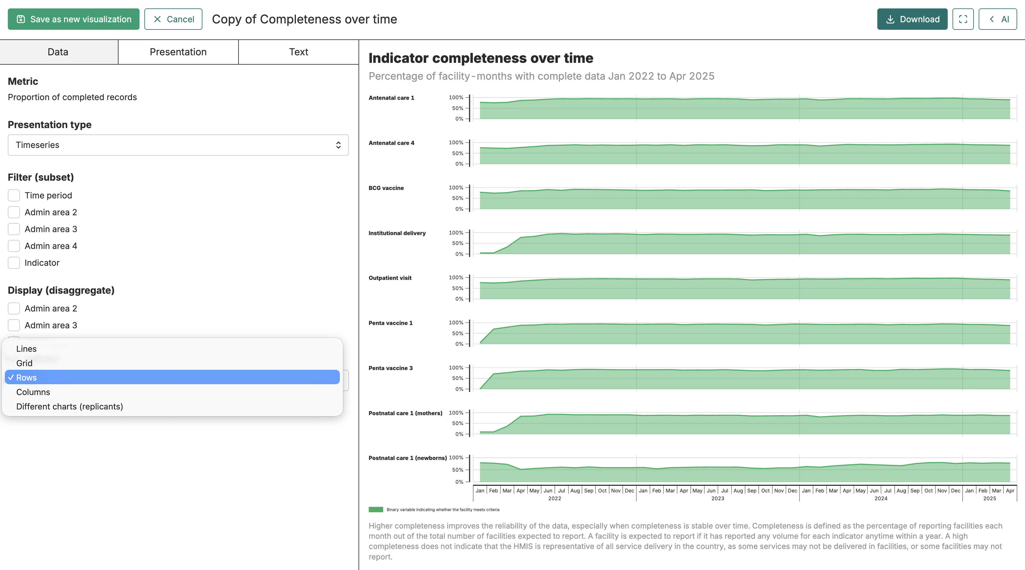
Section titled “Presentation tab”The Presentation tab adjusts how the visualization looks. For charts, you can change colors, show or hide data labels, and configure axis ranges. For maps, you can adjust the color scale and boundary styling. Tables have options for column widths and number formatting.
For pie charts, the Presentation tab lets you switch between a standard pie shape and a doughnut shape, choose a color scale, control data labels, sort slices by value, and group small slices together under an “Other” category. You can also enable Completion mode for percent metrics, which draws each pie against a fixed 100% envelope so the filled arc reads as the value itself — useful when comparing coverage indicators across multiple pies. When completion mode is active, you can also enable Show center value to print the value in the doughnut hole.
For HFA survey metrics whose results are at the facility level, tables have an additional option: Show sample sizes in column headers. When enabled, each column header shows the number of surveyed facilities that contributed to its values — for example, “Northern (n=55)”. This option only appears for metrics that carry facility-level survey data.
For scatter-style charts using the points display, you can enable Add connectors to draw lines between points in series order. This is useful when you want to show both individual data positions and the trajectory connecting them.
These settings don’t change what data is shown - only how it’s displayed. If you want a cleaner look for a presentation, or need to match your organization’s color scheme, this is where you’d make those adjustments.
The Presentation tab also includes a Custom value order section for any disaggregation dimensions shown in the visualization. Click Set order next to a dimension to open a modal where you can drag values into your preferred sequence, or use the search and move-to-top/bottom buttons for longer lists. Once set, the order applies whenever that dimension is displayed; a warning appears if a conflicting sort or display mode means the custom order is not currently active. Click the × button next to a dimension to clear its stored order.
Text tab
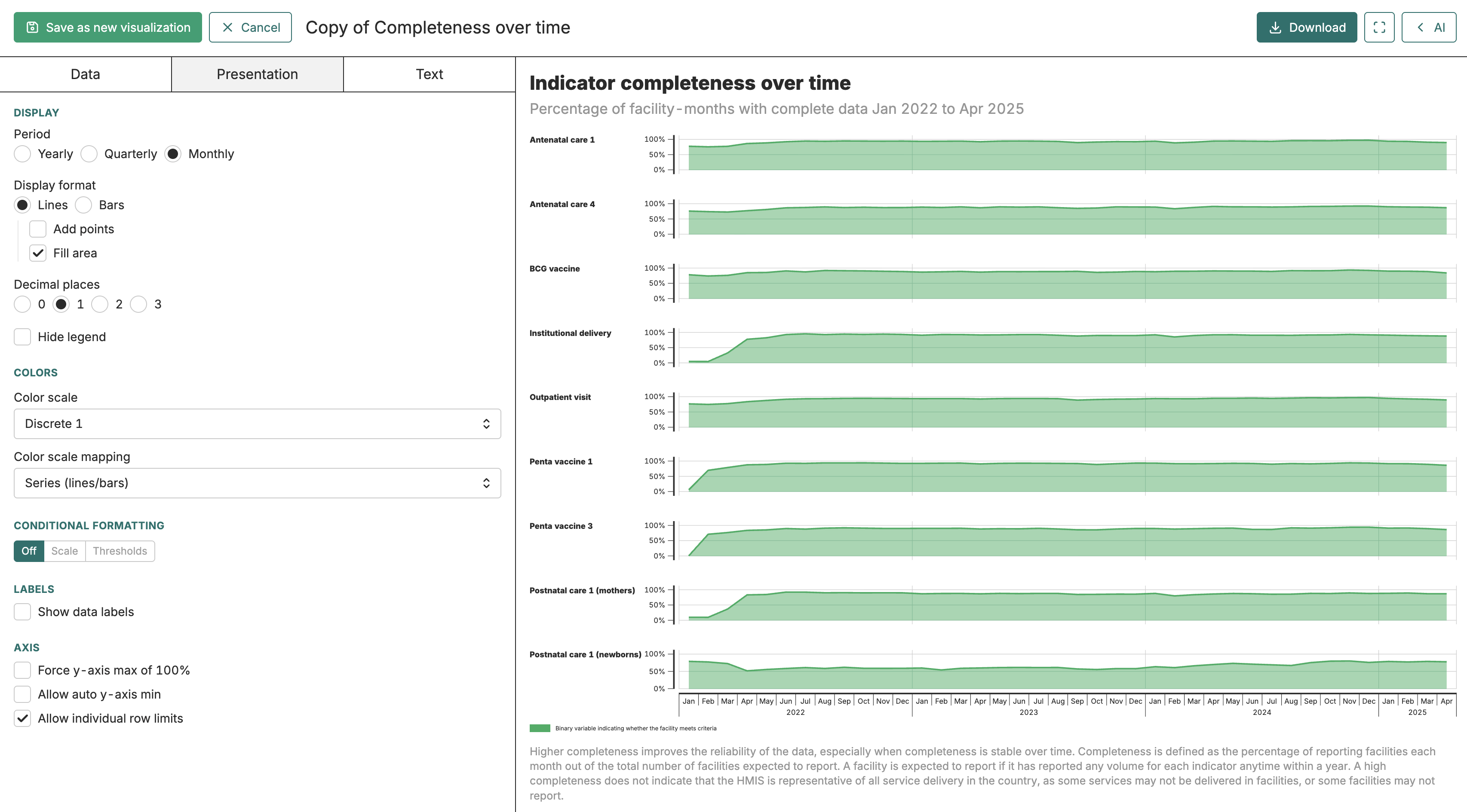
Section titled “Text tab”The Text tab adds context to your visualization through three text fields. The caption appears above the visualization as the main title. The sub-caption sits below the caption and is useful for additional context - like the time period covered or the data source. The footnote appears at the bottom and is typically used for methodological notes or data caveats.
In the caption, sub-caption, and footnote fields you can use special placeholder words that are replaced dynamically when the visualization renders. Use DATE_RANGE, PLAGE_DE_DATES, or INTERVALO_DE_DATAS to insert the date range of the data shown in the figure (this currently works only for timeseries visualizations). Use REPLICANT to insert the full replicant name, such as an indicator or an admin area (this only works when a disaggregator is set for different charts). These words must be spelled exactly as shown, using capital letters and underscores.
When live collaboration is active, caption fields use a collaborative text editor so remote collaborators’ carets appear as you type, the same way they do in the slide editor’s text fields. Typing in a caption field is covered by the editor’s undo and redo buttons, so Ctrl+Z inside a caption field pops the same shared history as structural changes to the visualization.
Good captions make visualizations self-explanatory. Someone looking at the chart in a slide deck shouldn’t need to read surrounding text to understand what they’re seeing.

Saving and organizing
Section titled “Saving and organizing”Click Save when you’re happy with your changes. If you’re creating a new visualization, you’ll be prompted to give it a name and optionally assign it to a folder.
Folders help keep things organized as your project grows. You might create folders by topic (“Coverage indicators,” “Data quality”), by audience (“Ministry presentation,” “Internal review”), or by time period (“Q1 2024 analysis”). To move a visualization to a folder, click the folder icon next to it in the list view.
If you want to create a variation of an existing visualization - say, the same chart but filtered to a different region - open the original and use Save as new from the menu. This creates a copy you can modify without affecting the original.
Exporting
Section titled “Exporting”Images
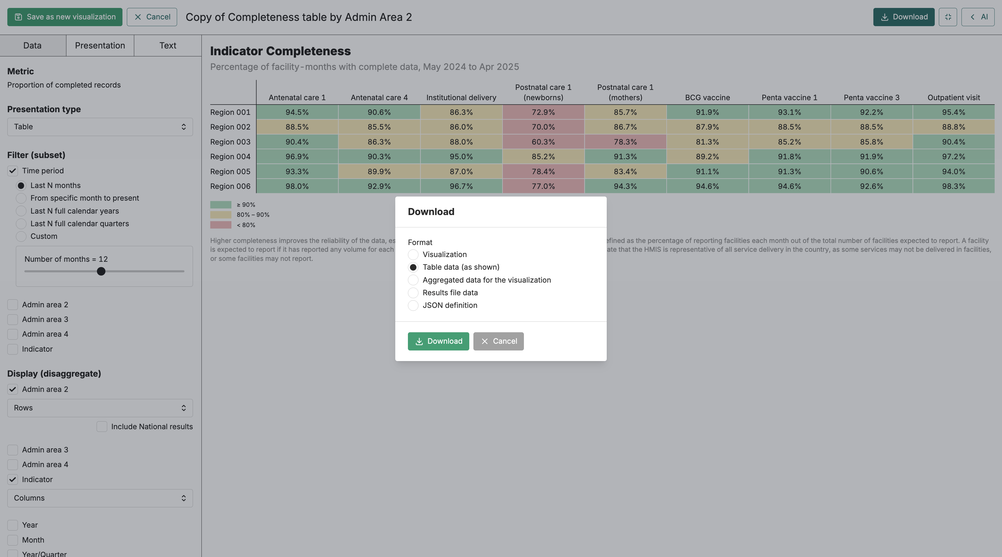
Section titled “Images”To download a visualization as an image, open it in the editor and click Download. You can choose PNG (good for presentations and documents) or SVG (good for further editing or high-resolution printing). The exported image includes the caption and footnote if you’ve set them.
Sometimes you need the underlying numbers, not just the picture. Click Download and select Table data to get a spreadsheet-friendly file containing the data behind the visualization. This is useful when you need to do additional analysis in Excel or share exact figures with colleagues.
Common issues
Section titled “Common issues”The visualization shows “no data”: Check that the results package attached to your project contains results for this metric, and that the metric has data for the time period and filters you’ve selected.
The chart looks cluttered or hard to read: You may have too many disaggregations active. Try removing one or filtering to fewer values. Sometimes a table is a better choice than a chart when you have many categories.
The disruptions chart shows an error about missing data values: The standard disruptions chart requires both an actual and an expected data value to compute the comparison. The Bayesian disruptions chart requires all four data values (observed, expected, lower bound, and upper bound). Open the Data tab and add the missing data values, or switch to a different chart type.
Changes aren’t appearing: Make sure you’ve clicked Save. The preview updates live, but your changes aren’t persisted until you save. If you navigate away without saving, you’ll lose your edits.