
Projects
A project is your workspace for analysis in FASTR. It contains a results package that provides pre-computed analytical outputs, and the visualizations, reports, and slide decks you create from those results. Understanding how projects work helps you find what you need and make sense of what you’re seeing.
Opening a project
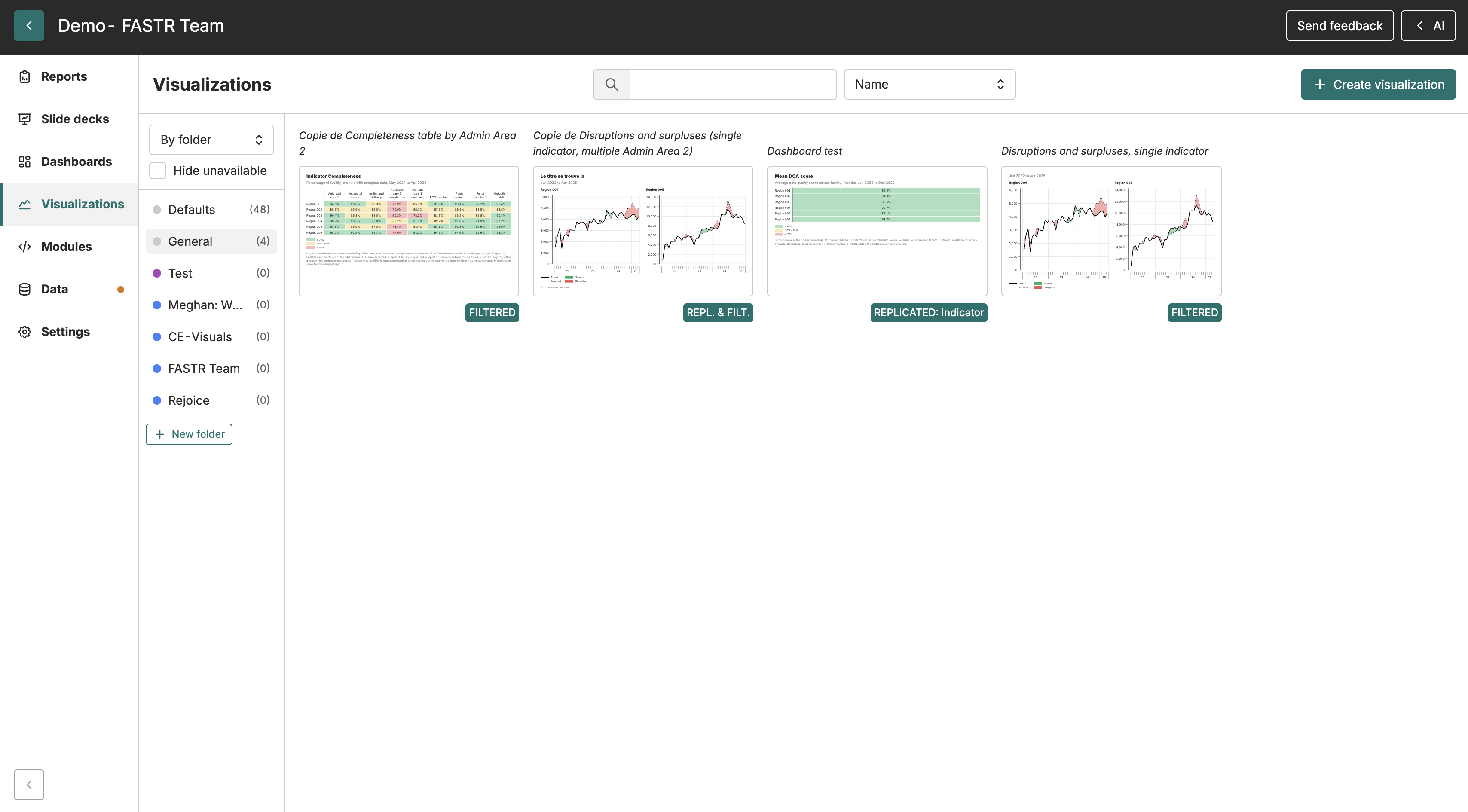
Section titled “Opening a project”When you sign in to FASTR, you’ll see a list of projects you have access to. The list can be sorted by name or by recently updated using the sort control at the top. Click any project name to open it. The project view has a navigation sidebar on the left with tabs for different sections - typically Slide decks, Visualizations, Metrics, Results package, and Settings. What you see depends on your permissions; viewers won’t see configuration options, for example.
The project name appears at the top of the screen. If the project has an Admin Area 2 scope, a badge showing the area name appears next to the project name.
Understanding the results package
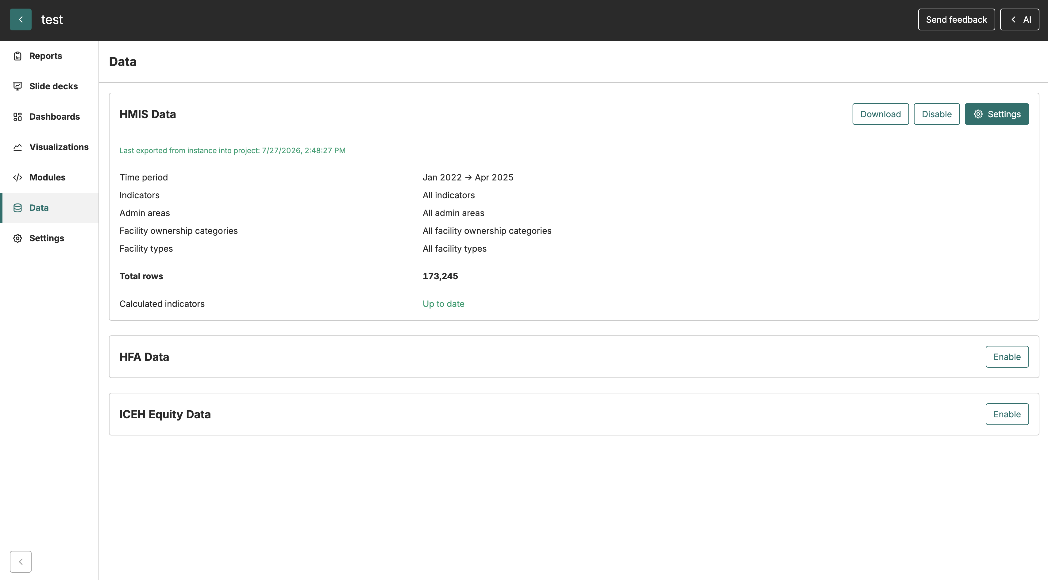
Section titled “Understanding the results package”Every project is served from a results package - a bundle of pre-computed module outputs generated at the instance level. The results package determines which metrics and data are available for visualizations, reports, and slide decks within the project.
To see which package your project uses, navigate to the Results package tab. The tab shows the package currently in use and, for editors, a package settings area with a dropdown to select a different package and an option to follow the instance’s pinned package automatically.
Switching to a different results package changes the data behind every visualization, report, and slide deck in the project. FASTR shows a compatibility report before any switch takes effect, listing any visualizations that would not resolve against the new package. You can review the impact and decide whether to proceed.
If the project has an Admin Area 2 scope and the selected package has no data for that area, a warning appears. Area-level metrics will show no data, but national-level metrics remain visible.
Data freshness and updates
Section titled “Data freshness and updates”Your project serves from a fixed results package. When your administrator generates a new results package with updated data and attaches it to your project, the visualizations will reflect the new package’s outputs. If your project follows the instance’s pinned package, it switches automatically whenever an administrator pins a different package. If you see results that seem outdated, check the Results package tab to see which package is in use and contact your project administrator if a newer one should be attached.
Locked projects
Section titled “Locked projects”Administrators can lock a project to prevent changes. A locked project works normally for viewing - you can browse visualizations, export images, and generate reports. But you can’t create new visualizations, modify existing ones, or change any settings.
Locking is useful when you’ve finalized an analysis and want to preserve it exactly as-is - for example, before sharing results with external stakeholders or archiving for future reference. If you need to make changes to a locked project, contact your administrator to unlock it.
Collaborating in real time
Section titled “Collaborating in real time”When multiple people have a project open at the same time, you can see who else is present. Live cursors show where your colleagues are pointing on the Visualizations, Slide decks, Reports, and other tab pages - each person’s cursor appears as a colored arrow with their name. The same presence indicators appear as small avatar icons on visualization cards, slide deck cards, and report cards, so you can see at a glance who is editing what before you open it.
Each person appears only once in the presence display, even if they have the project open in multiple tabs at the same time.
If you lose your connection to the collaboration server, a banner appears at the top of the screen letting you know. Your edits continue to save normally; the banner disappears and shows a brief “Live again” confirmation once the connection is restored. If your permissions change while you have a project open - for example, an administrator grants or revokes edit access - the collaboration session reconnects automatically so your new permissions take effect without requiring a page reload.
Getting help
Section titled “Getting help”Click Help in the project header to access guided tours, ask for help, send feedback, or open the documentation. Guided tours walk you through specific parts of the platform and can be started at any time from the Help menu.